A new geometric, minimal and elegant brand, a reference point for the company’s new targets.
As always, in our agency, the work begins with an important phase of research and study of the sector and the customer. The company needed a decisive change, immediately perceivable by the target and staff: a breath of fresh air to tell everyone that even experience can be innovative.
Our creatives have designed a new minimal and geometric brand, with a series of intrinsic values: the figure brings to the precision and an environment to be covered, the fine lines and the absence of color refer, instead, to the world of design and architecture, in order to point to the new targets decided by the company.

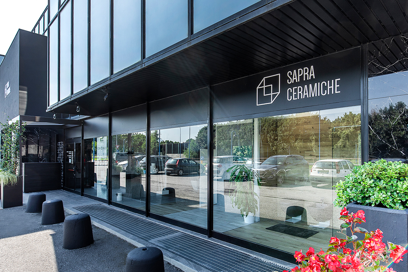
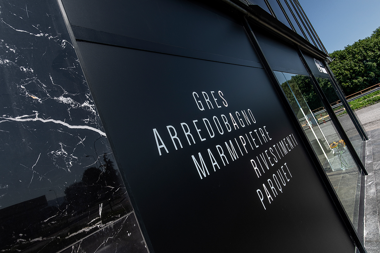
Starting from the symbolism of the brand, we created a graphic extension based on a modular grid that extends throughout the communication, from paper to the web, up to the fitting of the showroom.

Our work has developed into a complete corporate identity: folders, letterhead, personalized business cards, and stationery. A coordinated, harmonious communication with a strong style.


The showroom had a very old-fashioned look, it was quite uninviting especially from the out-side, also because the location of the entrance was not immediately understandable due to the many windows present.
Starting from this critical issue that needed to be solved (yes, we are concrete creatives, functionality is the basis of our projects) we started the restyling with this goal: to give an el-egant appearance to the showroom and display the Sapra Ceramiche product already from the outside of the building. We also wanted to focus the attention on the products on display, limiting the space dedicated to the windows and obscuring most of the remaining ones, which we used to communicate from the outside.


Digital communication, essential for this sector, must also reflect the elegance and high positioning of the corporate image built.
We have renewed the Instagram profile @sapraceramiche by devising a linear, dynamic and professional strategy: an editorial plan with posting of three images at a time, linked by a common theme, each with its own dedicated copy.
In this way the user, viewing the profile, has a very strong, pleasant and immediate aesthetic impact, in which he easily understands, right away, the different settings and the materials which compose them.
The creation of the website was based on a new layout designed on purpose, built on the idea of visual overlapping and intersections that characterize the entire image of Sapra Ceramiche.
The color transition of the logo as it passes from a black to a white section is interesting and innovative. The galleries with superimposed images – where we see the environments in the foreground and the materials connected to them in detail – are impressive and well-finished. Real touches of style!

Visit the website: sapraceramiche.it