The new name, Liquorificio Tevini, expresses the desire to open up to new targets and expand nationwide.
The new brand focuses on the name of the Tevini family, who have been recognised in the territory as producers of artisanal liqueurs for over a century.
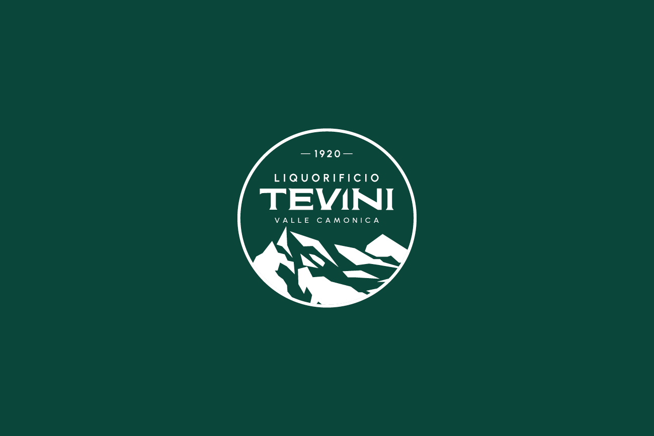
Written in a font with a retro flavour, redesigned and customised, the logotype is structured on three levels: the main level highlights the name Tevini, preceded by Liquorificio, which identifies the sector.
The Valle Camonica payoff conveys and maintains a strong bond with the mountain, its land of origin and, still today, the site of the production plant.

The logotype features two graphic elements that make it a complete brand: the symbol of the Adamello mountain, stylised and placed in a circle for continuity, and the founding date of the first Liquorificio, 1920, which immediately communicates tradition and historicity.
The result is a structured and strong, recognisable and memorable brand, which, compared to the past, correctly values and positions the business as a family-run, structured and solid company.
The brand is more understandable and harmonious, every choice made is functional to the objectives shared with the client, such as the dark green colour, kept to recall the nature from which the products are born, but adjusted to a darker and cooler shade, which is more institutional.
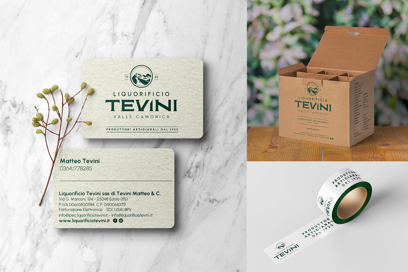
A second brand version was also created, compact and circular, useful as a social avatar, for merchandising and special products applications with their own brand.


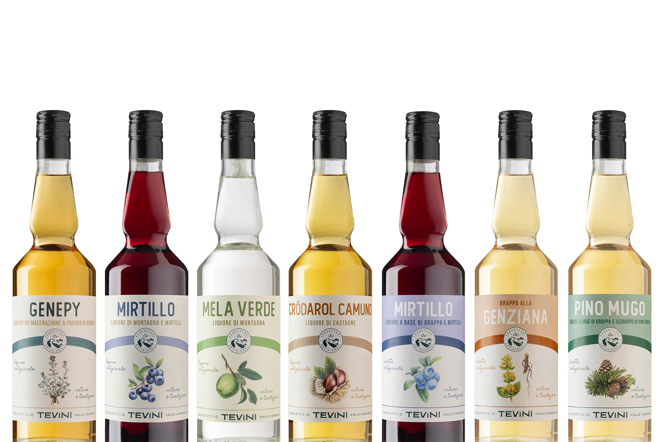
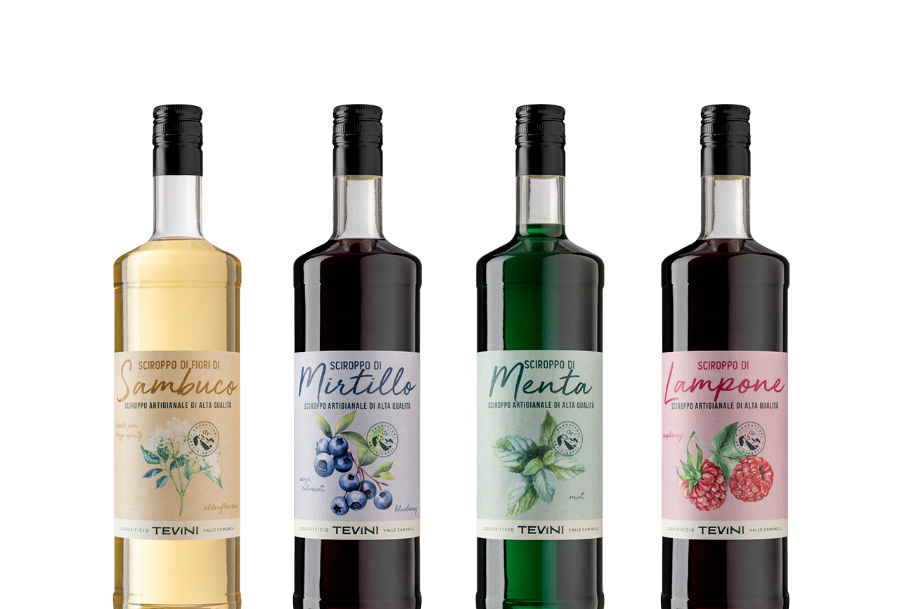
The repositioning strategy focused on label design: the restyling of more than 60 product labels, an incredible job.
A large number of products, divided into various categories – liqueurs, bitters, grappas, syrups, jams, candies – and special products with their own identity, such as Bombardino, white grappas and the famous Elixir Noreas 100 years: the old labels no longer represented the company and, above all, did not have a coherent nor up-to-date style.
The subtlety of our work was to succeed in combining continuity and innovation, translating the old image into a more harmonious, professional and aesthetically pleasing one, without distorting it so as not to mislead the historic, loyal clientele, but one that positively emphasised craftsmanship and the link with mountain raw materials.
The first step was to research and personalise the ingredients featured on the labels: the illustrations are now all consistent, in style and presentation, and draw on illustrations from the botanical world. A choice of style that perfectly represents Liquorificio Tevini’s artisanal vision and bond with nature.


Combined with the illustrations, the natural paper effect background and the selection of pastel colours help to complete the new brand vision and transfer this image of nature and craftsmanship.
In addition to the single layout, which is consistent between one reference and another in the same category, the combination of the various product ranges is linear and functional: they keep their distinctiveness and, together, convey the brand image well.


All Creative’s work continues with social communication and digital advertising creativity and strategy during important periods.
In 2025, an investment is planned for the new website and online shop, which will be redesigned and completely customised.