THE CONCEPT
The goal of each organization is improvement, a personal and corporate Growth in the various aspects and daily situations.
To express this concept, we chose 8 words which, taken individually, represent the areas of major attention and commitment for Sabaf which constantly tries to increase their value.
Everything is amplified from the initials of these nouns, that joined together form the term Crescita (Growth), which is the focus of the 2017 Annual Report.


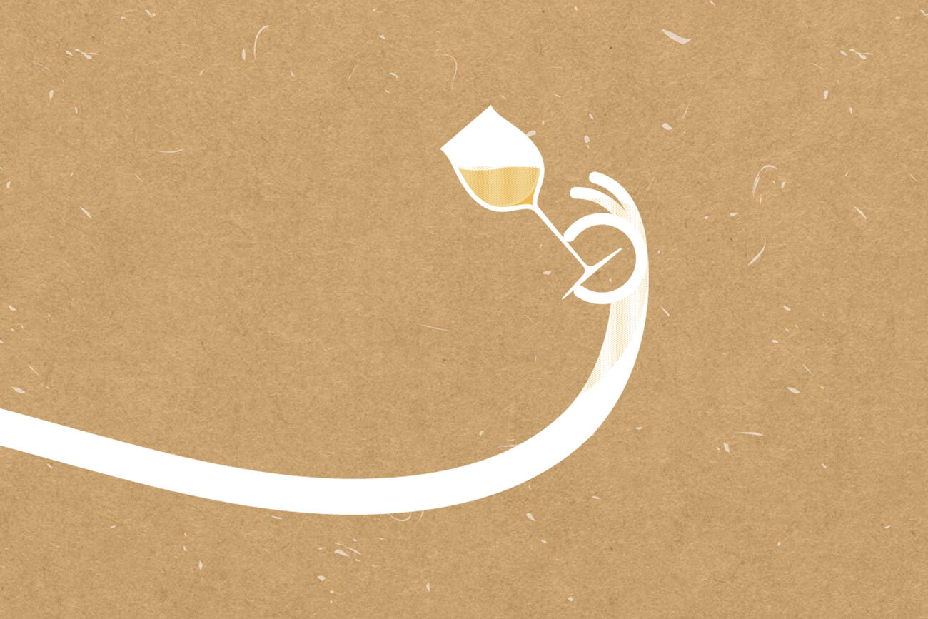
Through the “paper-cut” technique ✂, masterfully realized in collaboration with I love Paper, each word was represented by objects, icons, hand-cut elements to create paper worlds which were subsequently photographed to create colored separators and lighten the consultation of the volume.


By modulating the shadows and using different thicknesses, we were able to give the eight images a photographic 3D appearance while developing symbolic (iconic) concepts through a simplified and 2D graphics.
For what concern the creation of the printed volume, we used the same type of paper for the outer cover, in order to create a chromatic link with the internal visuals.
On the front cover, the word “CRESCITA” (GROWTH), which gradually rises upwards, was imprinted on the paper by a bas-relief with glossy lamination, which gives a tone-on-tone effect. The brand and title were printed with a silver offset Pantone, while the inside of the volume is entirely printed on Fedrigoni Arcoset W/W.


Thanks to the collaboration with the Fedrigoni paper mill, which provided us with great support, we developed the final visuals entirely with natural paper from the Woodstock range, (80% recycled paper 20% FSC certified cellulose); crossing the various pastel shades colors, we defined minimal and symbolic illustrations, treated in 2 colors, and in addition we used white for the capital letter that stands out in the center of the scene.


Very particular is the packaging, with Swiss binding, which allows us to free the spine of the internal volume, made of paperback binding covered with canvas, dissociating it from the spine of the cover.
The internal volume is glued on the 3rd cover. This reduce the rigidity and facilitate the leaf-ing of the nearly 300 pages of the volume, maintaining a classic exterior appearance.
A creative and painstaking work that achieved the desired effect and positively impressed the client and the final public.