CONCEPT: to underline Berlucchi’s bond with the territory and with the Franciacorta brand.
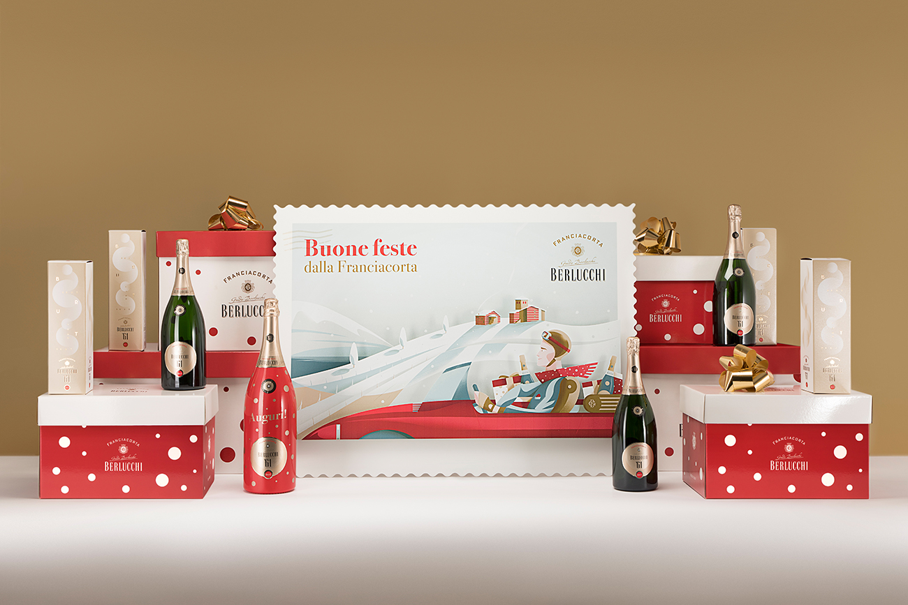
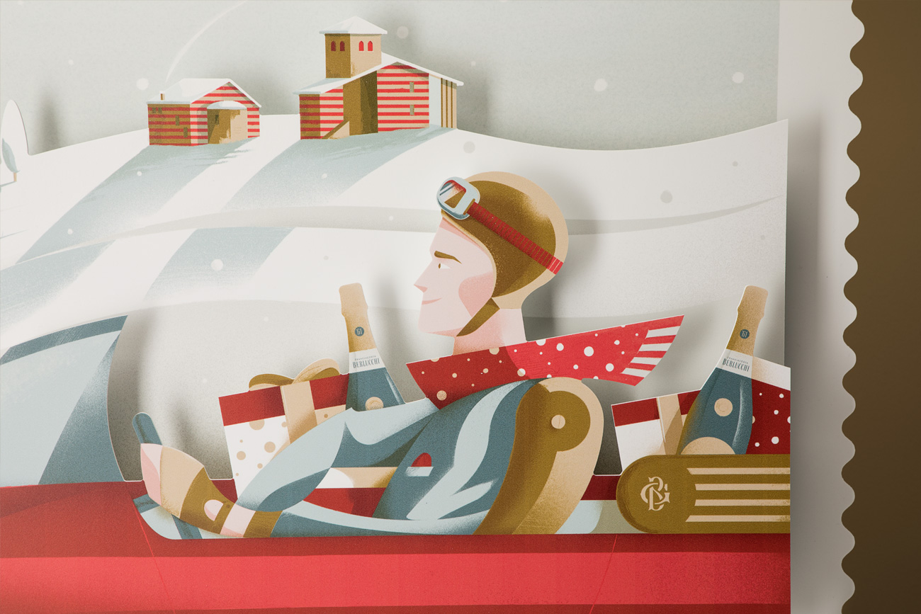
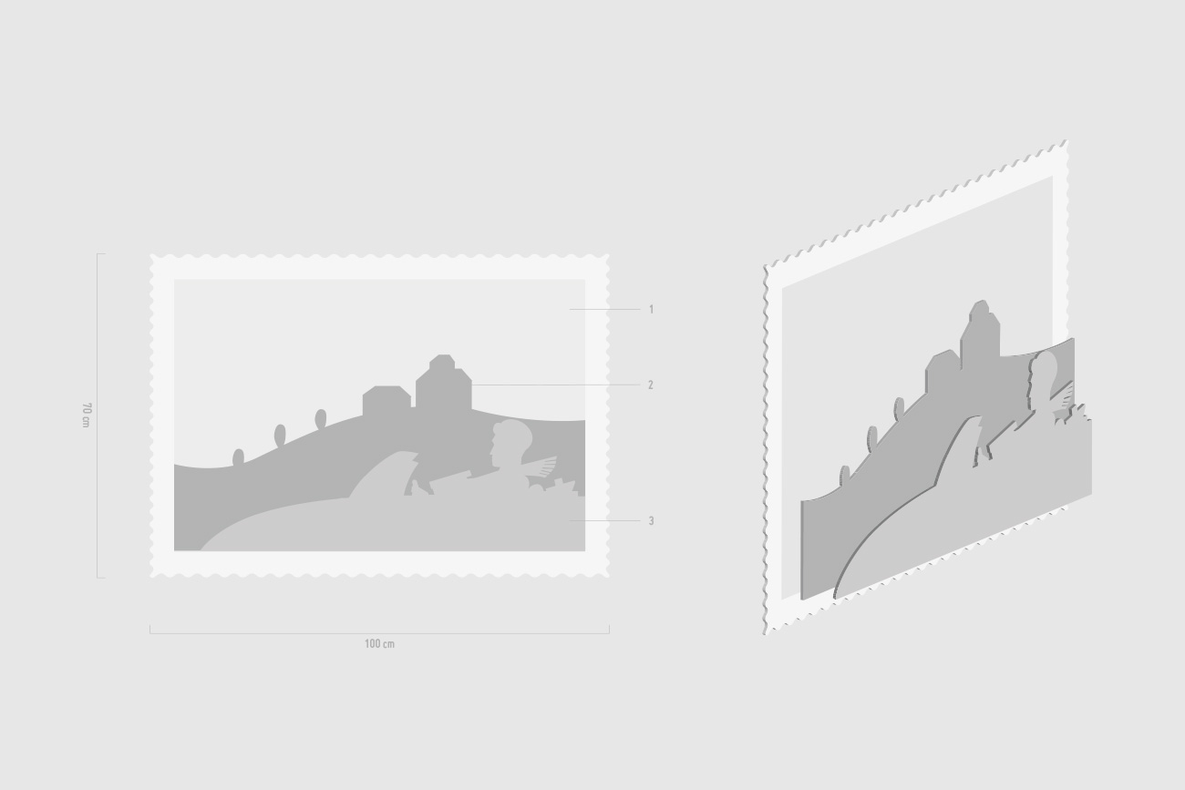
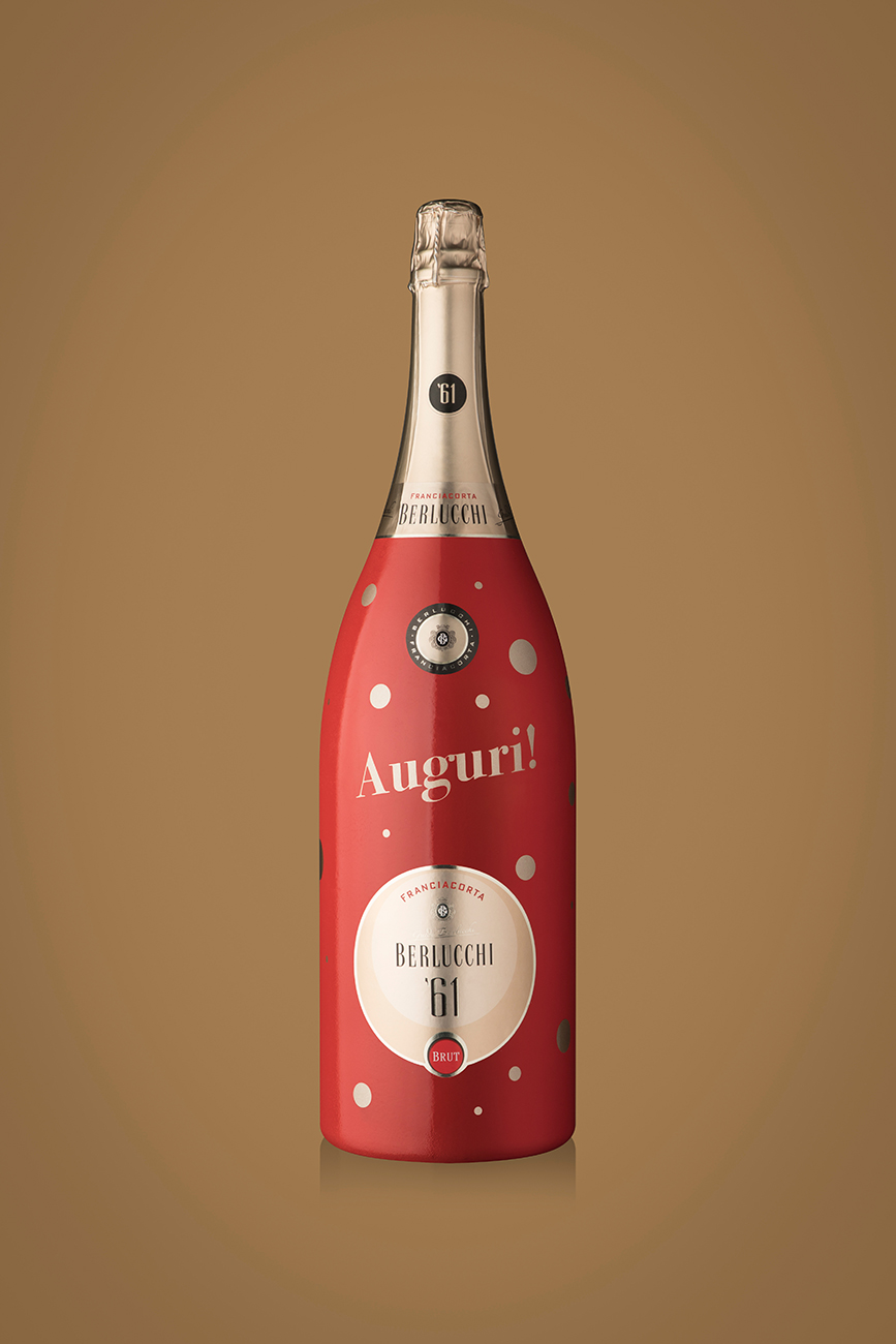
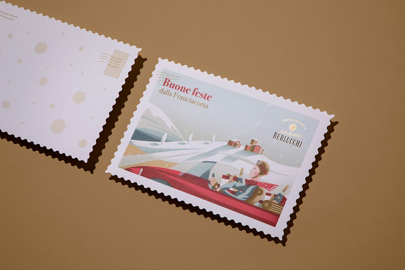
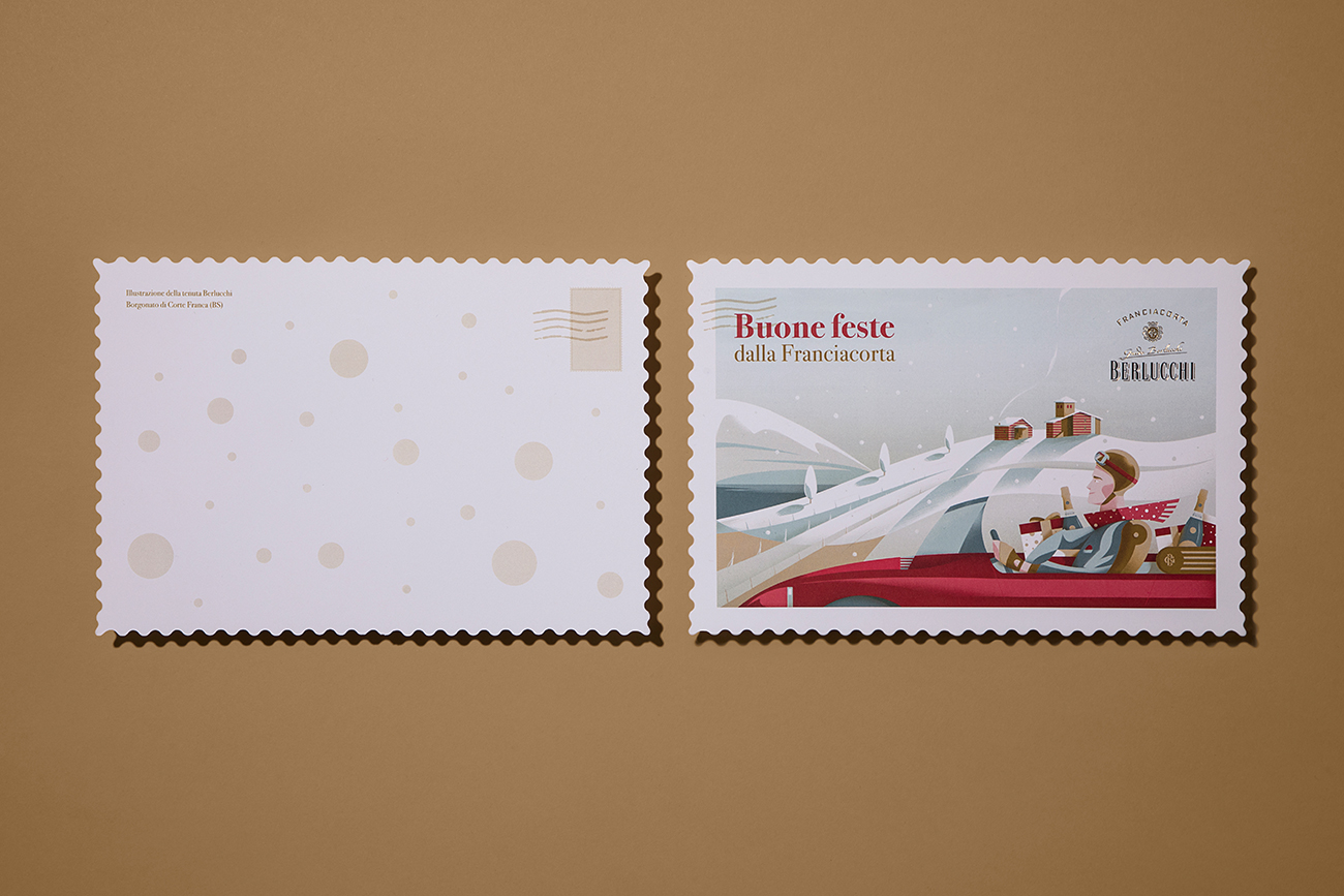
Greetings and best wishes from Franciacorta communicated through a large illustrated postcard, which at the same time becomes a back-drop for the display case, completed with a Berlucchi’61 Brut jeroboam, hand-decorated with graphics recreated on vinyl, and huge gift packages in pendant. We thought of an illus-tration with a slightly retro spirit, set in the typical winter scenery of the moraine hills of Franciacorta, right where the Guido Berlucchi Castle is located, in Borgonato di Corte Franca.
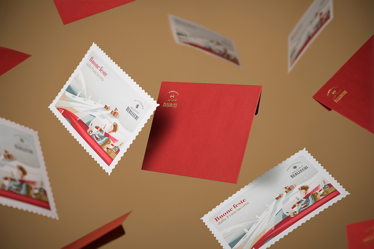
Entirely made by our creative director and illustrator Alessandro Vairo, the main subject of the scene is a handsome young man driving his sports car, returning from the Guido Berlucchi winery where he has just bought some Berlucchi Franciacortas to give away for the holidays.
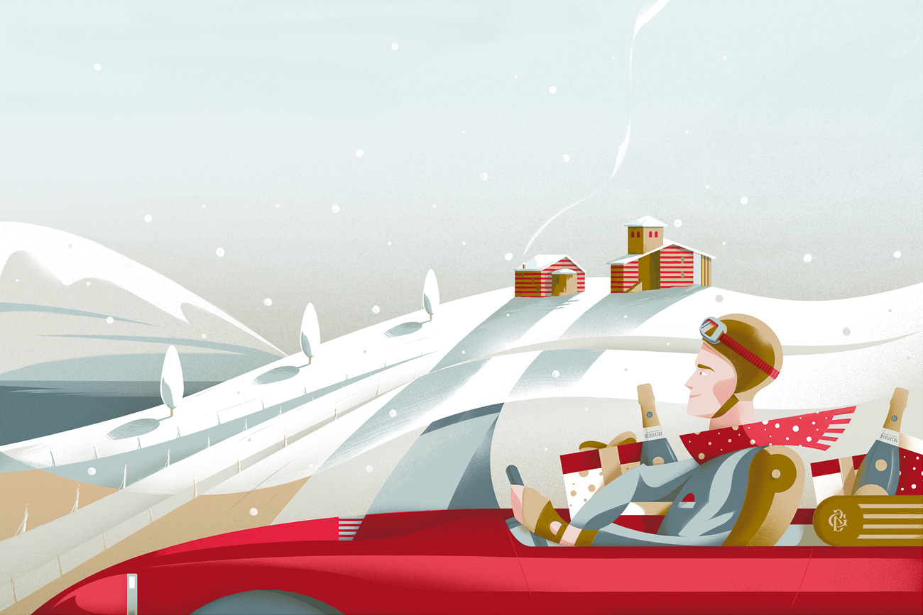
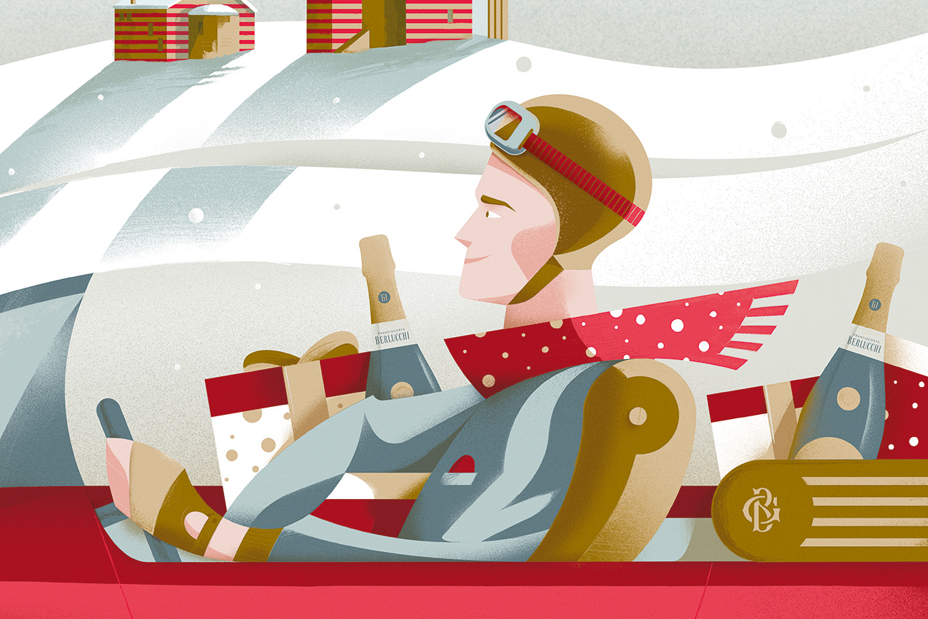
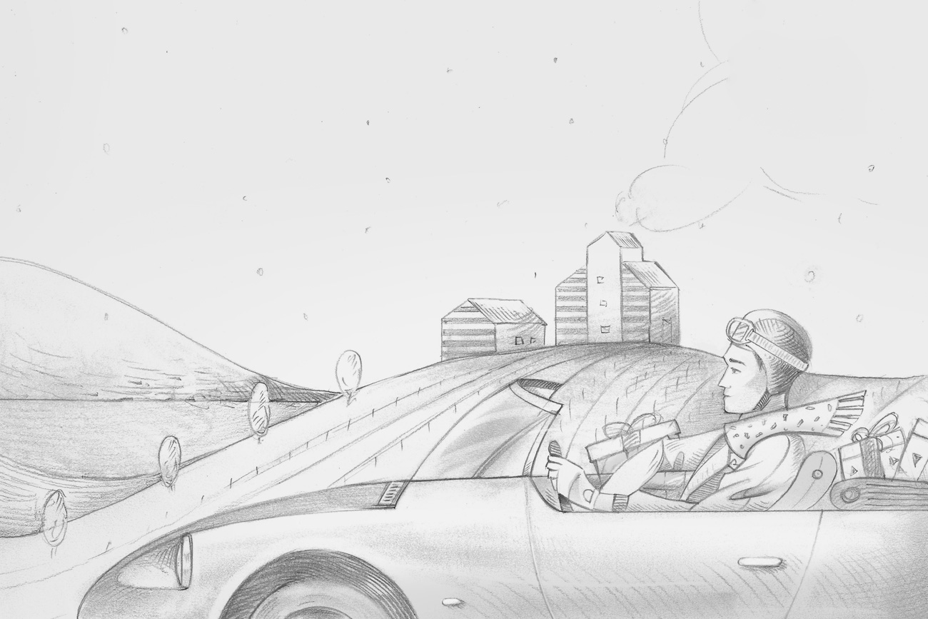
The window sign was designed as a real postcard, but in a giant format, to act as a backdrop for the bottles. We started with a representation that could be broken down into several lev-els (the main subject, the hills and the background). Starting from the base, shaped with the classic wavy style, the other levels were then surmounted to recreate the complete image. In this way the final result appears more three-dimensional, while using a two-dimensional graphic image.
For the final composition of the showcase, the idea was that of a modular proposal, which could be adaptable to the various set-up needs of the shopkeepers, providing a complete kit consisting of:
- Maxi illustrated postcard;
- Jèroboam Berlucchi ’61 Brut decorated by hand;
- Gift packages in two formats;
- Magnum Berlucchi ’61 Brut;
- Berlucchi ’61 Brut cardboard boxes;
- Guide for the correct display of the windows.

An accessory and concomitant element to the Christmas project is the 22 × 15 size greeting card in Fedrigoni Splendorgel paper, with a gold laminate logo; sent in a century Sirio Pearl – Red Fever envelope, made of pure cellulose paper with pearlescent surface.
Thanks to the illustration and its fresh and immediate language, we obtained an original and unique Christmas communication, in which the values of the company emerge clearly to-gether with a strong branding message, which differs in a decisive way from the previous in-stallations.
A truly ✨sparkling✨, exciting and inebriating project, which was very successful among the recipients of the kit and met (and exceeded) our cli-ent’s expectations! Now that we are very proud of our work we just have to… celebrate! #cheers