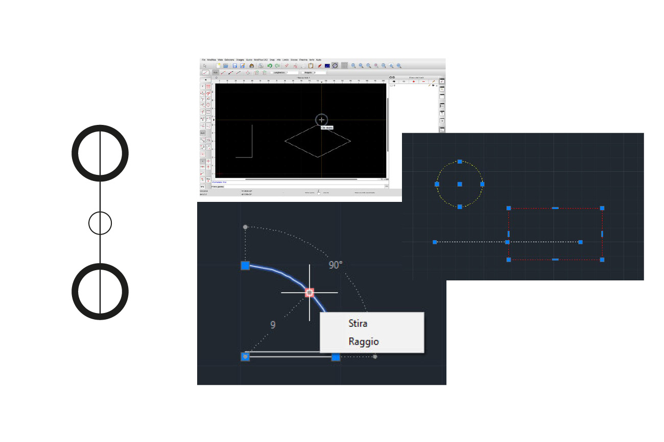
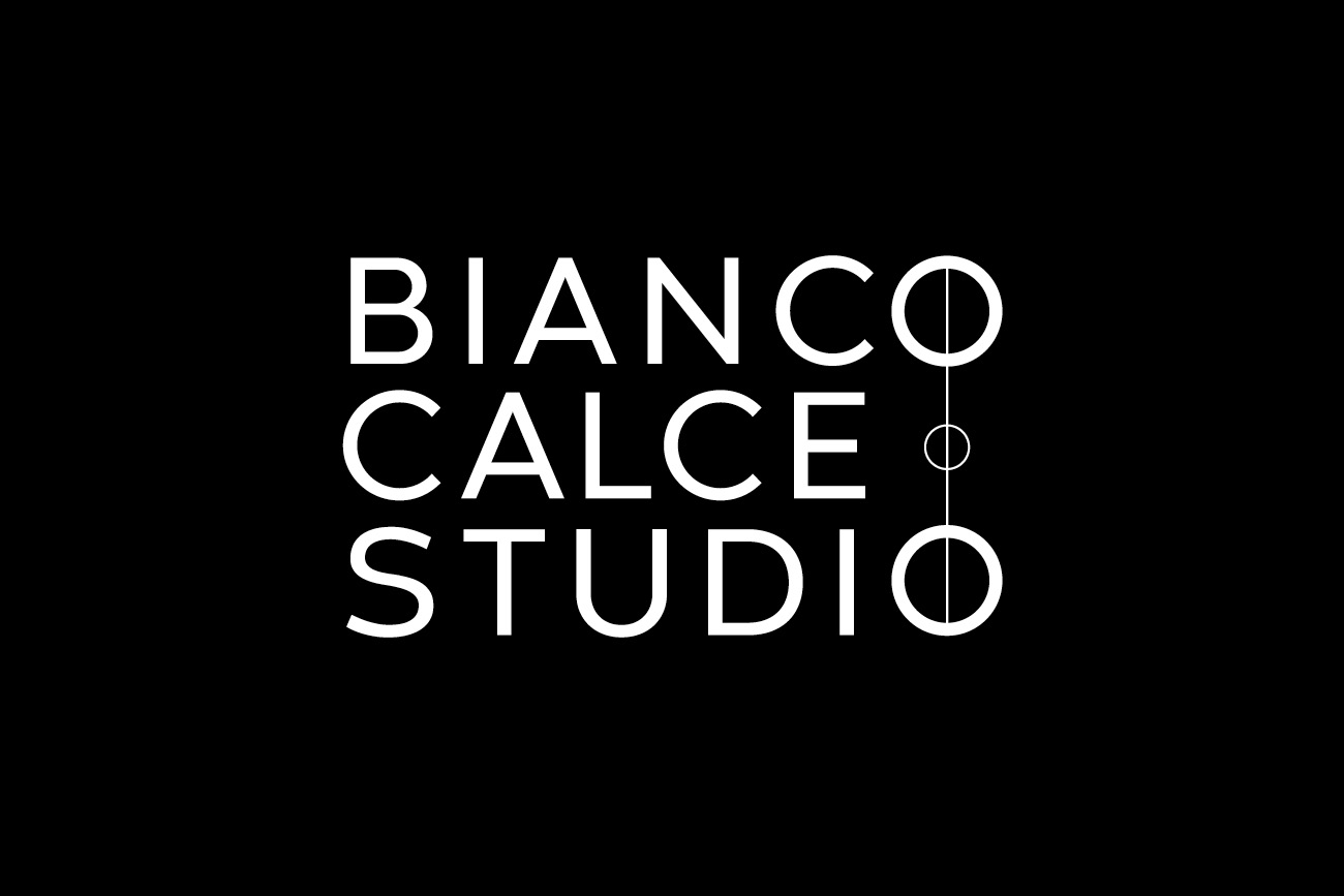
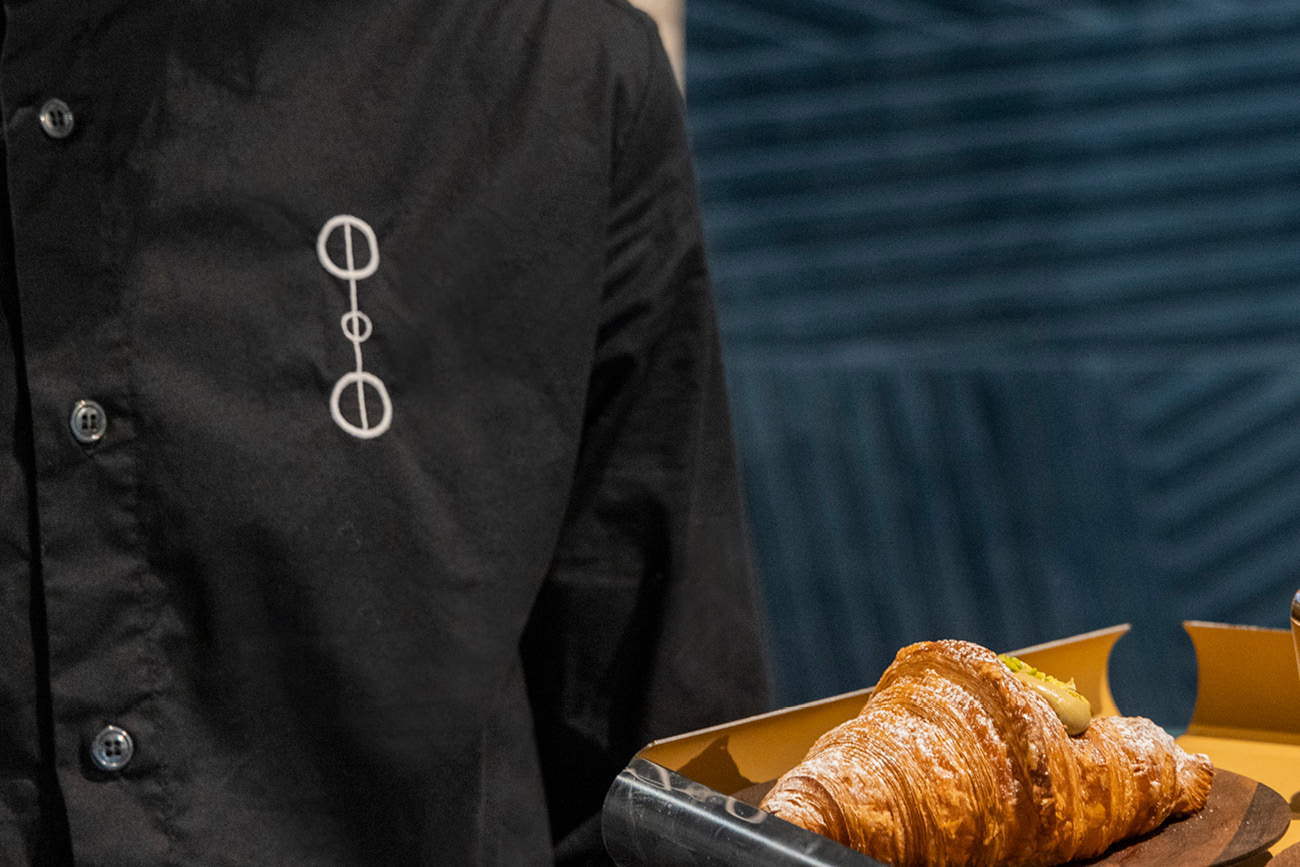
To embody the essence of Bianco Calce Studio, All Creative chose a minimalist yet highly symbolic approach, designing a brand that combined clean, linear lettering with a distinctive graphic element. Consisting of a line and three circles, the latter not only conveys the concept of ‘project’ and ‘creation’, but also becomes a real visual language.
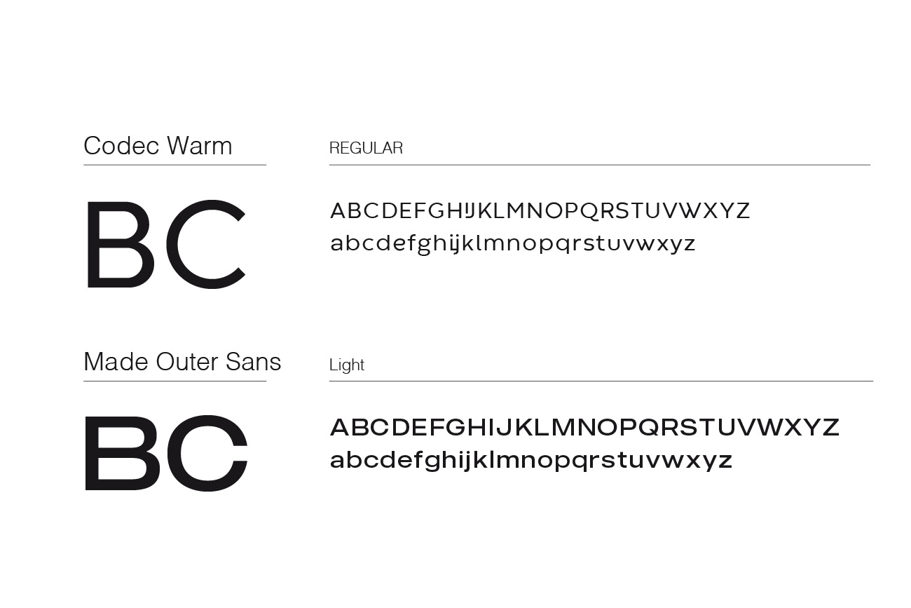
Developed with a modern and essential lettering that conveys professionalism and simplicity, the logotype is completed with the graphic element of line and circles, representing a visual dynamic that recalls the connection between different disciplines and worlds.

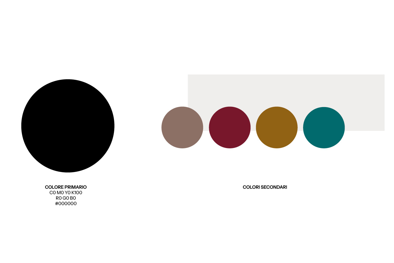
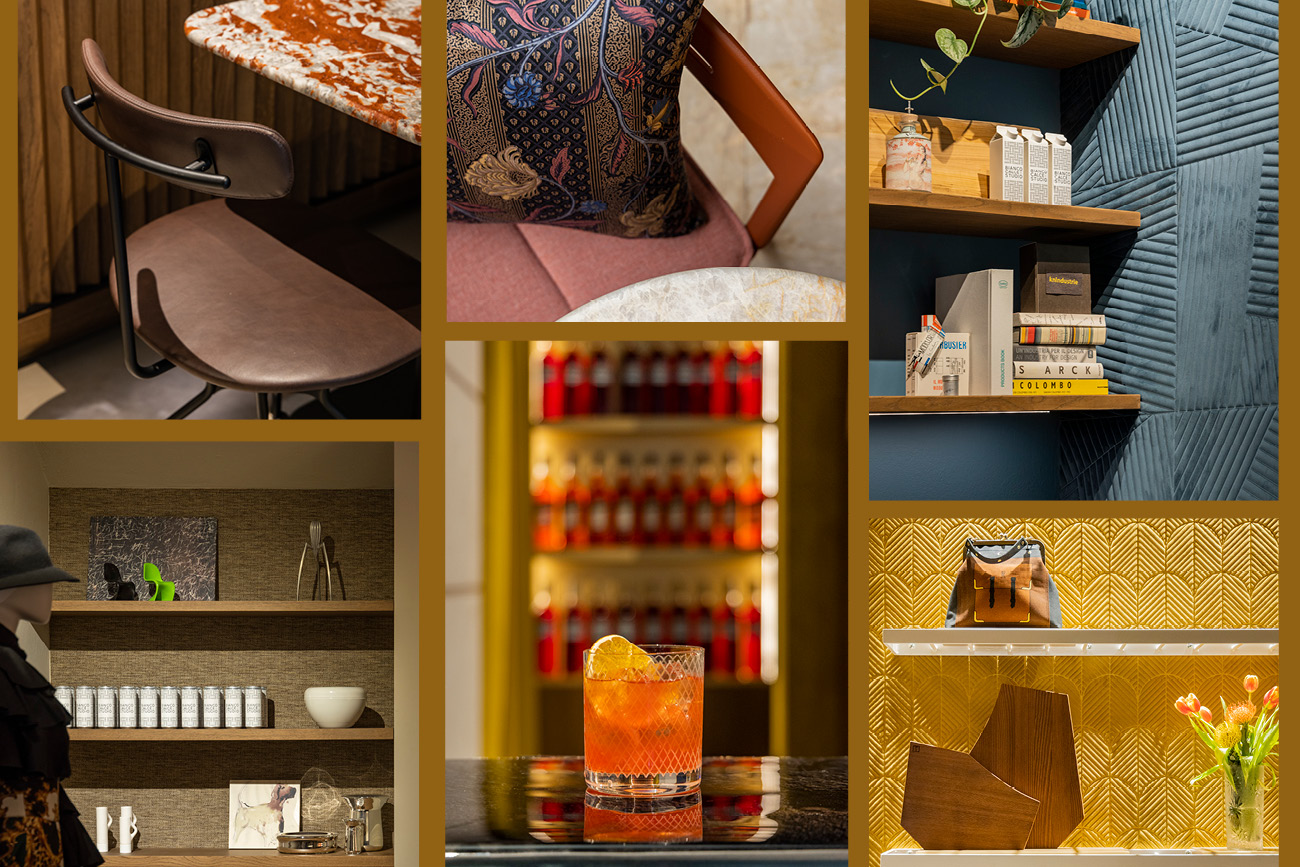
THE COLOUR PALETTE, MADE UP OF NEUTRAL TONES ENHANCED BY WARM, BOLD COLOURS, REFLECTS THE VERSATILITY OF THE SPACE AND ITS ABILITY TO WELCOME UNIQUE SENSORY EXPERIENCES. THIS AESTHETIC CHOICE REINFORCES THE VISUAL IDENTITY, BALANCING ELEGANCE AND CREATIVITY.
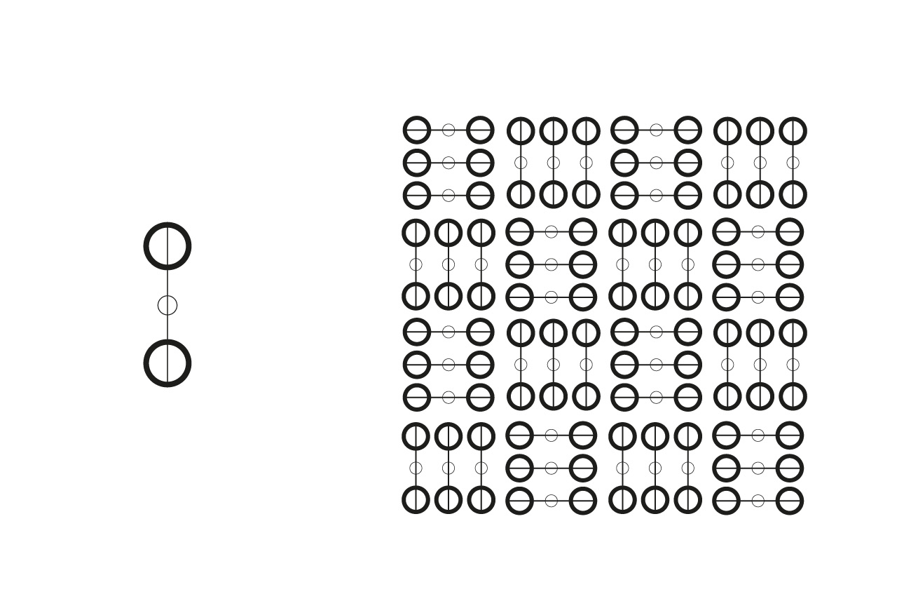
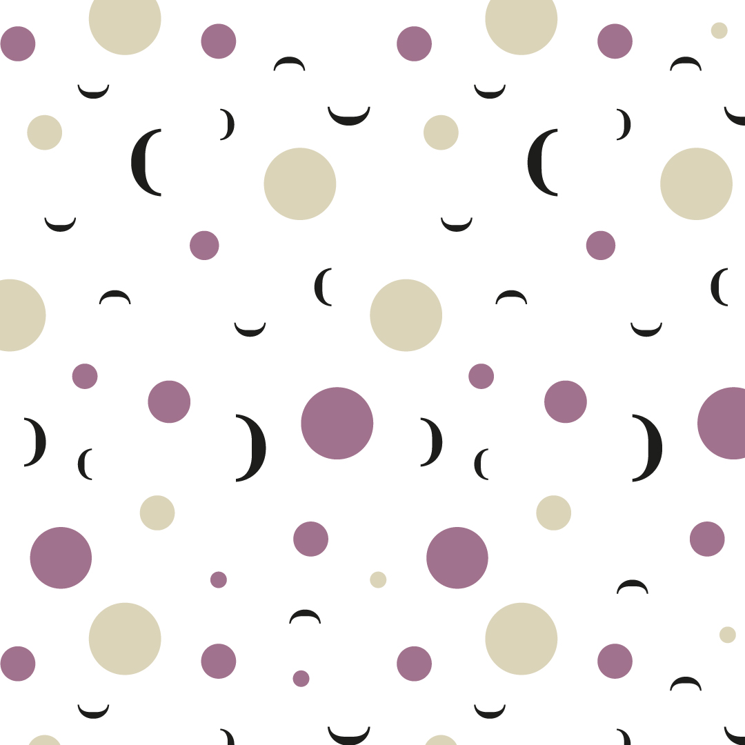
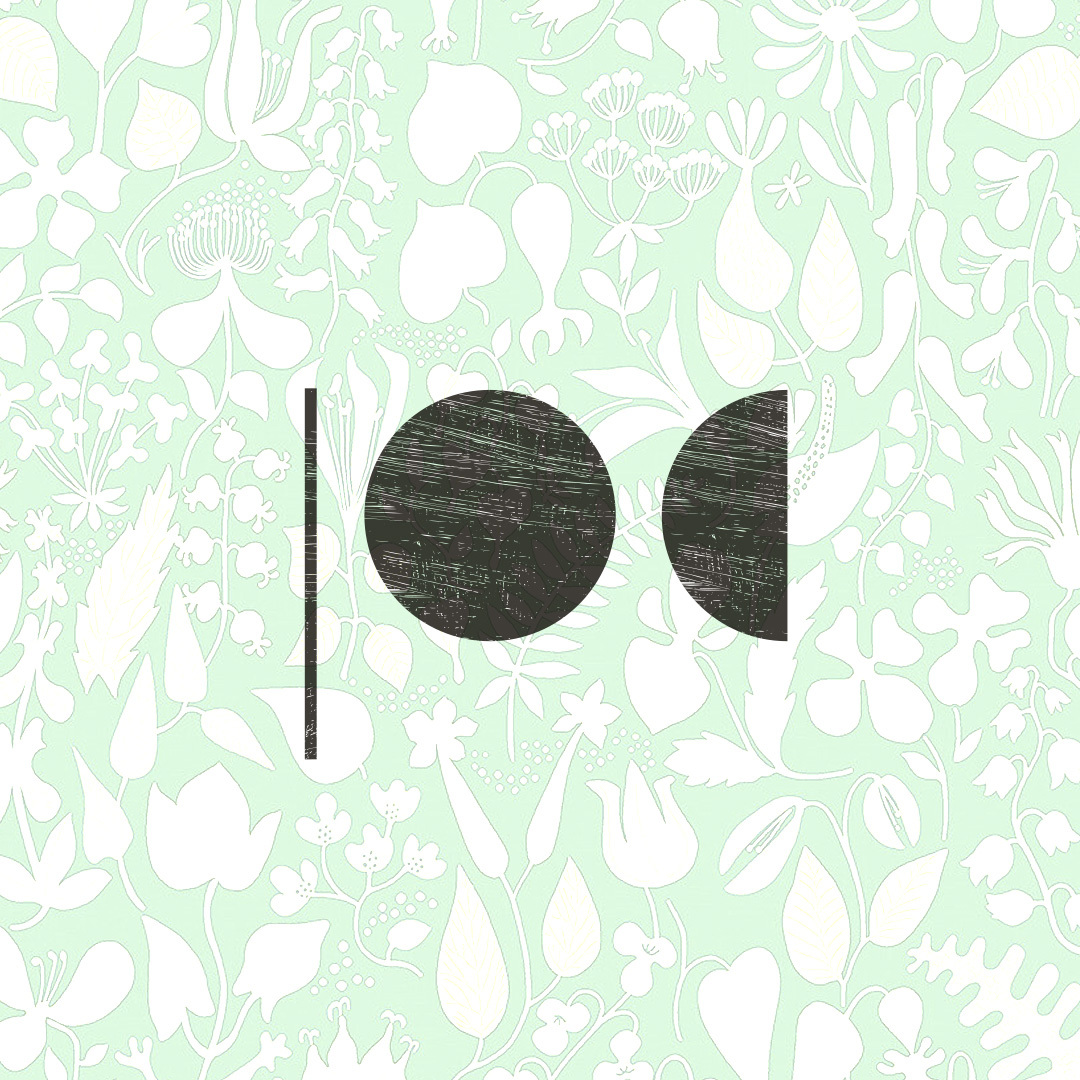
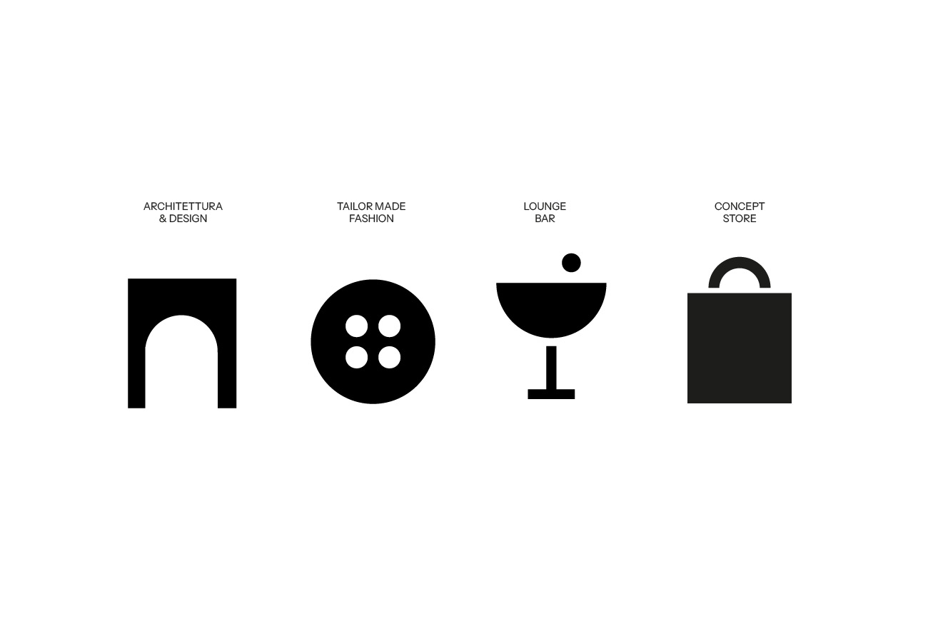
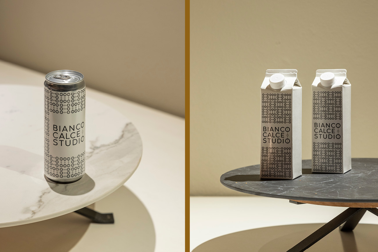
The graphic element has been transformed into a modular pattern that becomes the core of the visual communication. This pattern is further split into its basic elements, creating an iconographic glossary representing the different souls of the studio: from design to craftsmanship, from fashion to gastronomy.


The visual identity was applied to a wide range of media. Corporate material: business cards, letterheads and menus combining minimalist aesthetics with memorable visual details. Packaging: cans, boxes and packaging incorporating the distinctive pattern to emphasise craftsmanship and attention to detail.

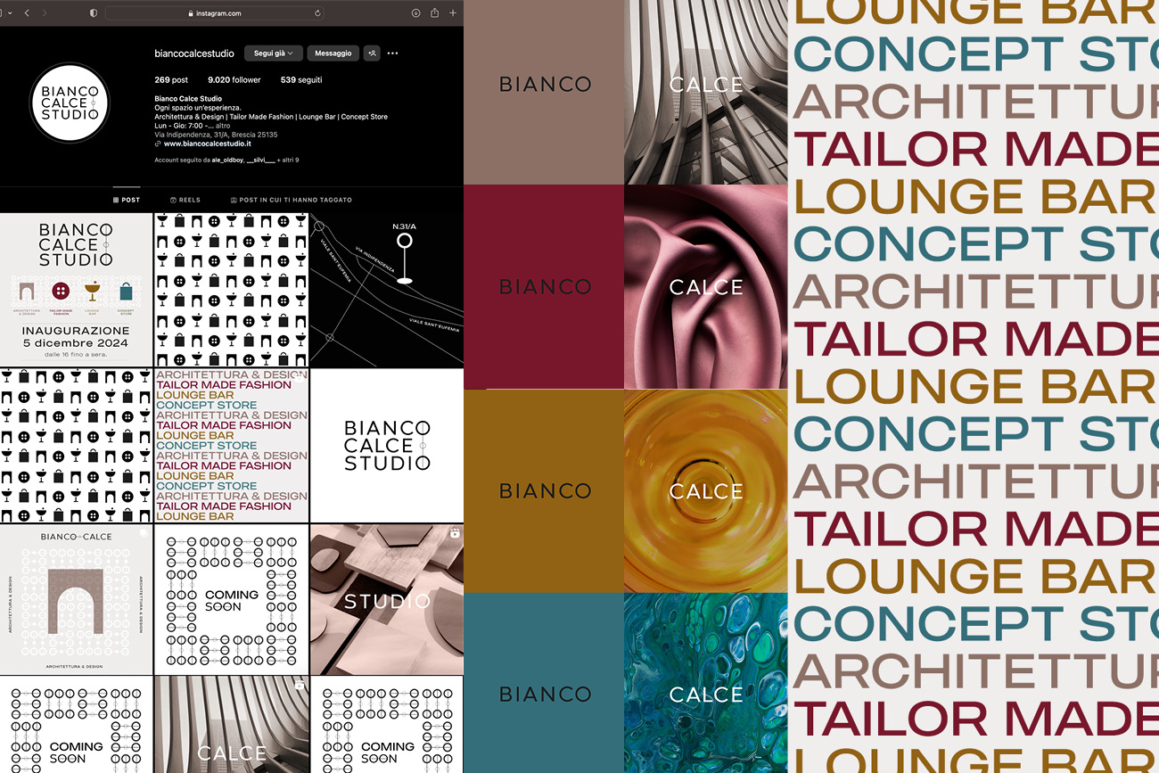
The approach for the social launch of Bianco Calce Studio’s new reality was based on the idea of sensory contamination, inspired by the etymology of the word ‘synaesthesia’, derived from the Greek sýn (together) and aisthánomai (to perceive). Synesthesia is a perceptual phenomenon in which the stimulation of one sense evokes a sensation linked to another sense, such as perceiving the colour of sounds or the taste of images.
Starting with the name Bianco Calce and its strong material and sensory appeal, we created a strategy that involved all senses. We decided to work with oxymora and contrasts to evoke curiosity and feelings. White, the key element of the name, was opposed to the distinctive colours chosen to represent the brand’s categories. This visual contrast created an alienating effect, able to capture attention and trigger imagination.
The word ‘Calce’, on the other hand, was linked to contrasting material textures, each representing the different areas of expertise of the firm. This combination allowed the variety of the offer to be conveyed through a sensorial and sophisticated visual language. The text narrative was divided into two main stages: in the teaser phase, the enigmatic and evocative copy aimed at attracting attention and stimulating the senses without revealing the complete new brand.
The audience was invited to question and immerse themselves in an atmosphere of anticipation. In the brand unveiling phase, the texts became more narrative and explanatory. They told the story of Bianco Calce Studio’s evolution, the new realities born from within, and the visual and conceptual imagery guiding the project’s identity.
This approach allowed us to build a dialogue with the public through an immersive and engaging experience.
The biancocalcestudio.it superwebsite was designed as a one-page site that embodies the visual identity of the brand and its connection to the world of design. The structure is clean and minimal, characterised by the elegant contrast between black and white, which creates a neutral base to highlight the four distinctive colours of the corporate identity.
Iconic brand elements, such as the three circles and the line, have been dynamically integrated into the site design. These graphic elements animate fluidly during navigation, and can be found, for example, in the gallery buttons, thus creating an interactive and immersive experience that recalls the concept of design and creation.
Another core aspect of the site is the large space dedicated to images, which visually narrate the Bianco Calce Studio world. Curated photographs and sophisticated settings combine with the textures in the layout, emphasising the concept of a ‘container of things’ and underlining the unique mix of disciplines and worlds represented by the studio: design, fashion, gastronomy and craftsmanship
The refined and intuitive interface offers a fluid and immersive browsing experience. The overall mood is evocative of the world of contemporary design, combining visual clarity, animated graphic details and strong visual communication, for a site that becomes the brand’s natural point of reference.
Visit the website: biancocalcestudio.it