I listen, I design, I realise. This is the mantra chosen by Francesca for her projects and, paraphrasing her, if it’s true that Every place has its colour, we believe that Every place, even digital, has its heart. That of Pistacchio&Caffè beats to the tune of the rebrand we have curated, which in the Superwebsite carefully echoes shapes and colours. The first section of the homepage breaks down the symbol, transforming it into a mask for photos and text that appear in contrast to the brand’s colour palette.
Circles and semicircles are recurring elements in the Superwebsite, sometimes obvious, some others hidden, but always an expression of style, the result of a choice consistent with the brand identity. The cursor, for example, is a circle that when layered on top of the buttons changes colour, letting its original shade flow until it fills the element in the same way that designer Francesca’s creativity fills the spaces of the homes and projects she curates.

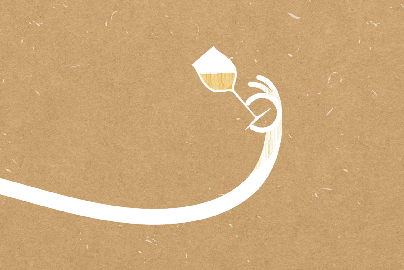
LIKE THE CIRCULAR SHAPES, THE LINE – WHICH ALONG WITH THE CIRCLE SYMBOLICALLY REPRESENTS A P – CROSSES THE LAYOUT OF THE SITE, ACTING AS A CONTRAST AND LINK BETWEEN SECTIONS THAT ARE DISTANT IN SPACE BUT CONCEPTUALLY CLOSE IN CONTEXT.
Particular attention has been paid to the presentation of the projects, which, through an irregular grid characterised by the same shapes and colours that make up the brand identity, showcases the soul of the furnished spaces, leveraging the ample space dedicated to photos. Gallery, images and texts become testimony and narrative of the creative, original and unique nature of each project.
IT IS HARD TO PUT A PRICE ON ART, BUT A GOOD STARTING POINT IS AN ARTFUL E-COMMERCE.
The Pistacchio&Caffè Superwebsite is completed by a custom-designed e-commerce, which gives plenty of space to images of the products on sale – lamps, prints, pillows and paints – in continuity with the visual identity of the website. The font hierarchy guides the user through the purchasing process, highlighting the product categories to browse, as well as the price, colour and shape variations, and cart and checkout buttons.
Web development was performed using advanced technologies and optimised programming languages. The style implementation uses HTML5 and CSS3, while the use of the SASS preprocessor allowed us to create streamlined and customisable code using MIXIN and variables, making it easier to handle media queries and complex elements.
In order to add animations, we integrated the GSAP library, which together with JavaScript brought dynamism and interactivity to the site, offering a smooth and visually appealing user experience.
The responsive design was developed according to the principles of fluid web design to ensure a uniform view on any device. This approach allows the site to automatically adapt to the screen size, adjusting layout and proportions without compromising either aesthetics or functionality.
To verify the output on different platforms, we used mock-ups that allow us to test and optimise the display on several mobile devices and browsers, carefully checking every aspect of the interface.
Visit the website: pistacchioecaffe.it